
Product Designer, UX
My time at Talent Inc was spent working on researching the user flow and designing A/B tests that would help increase conversion rate and customer retention for the career products e-commerce site. I also spent a lot of my time conducting interviews with clients and agents to better understand the user experience and its pitfalls. The challenges facing Talent Inc were different from the challenges I worked on solving at Fareportal, as we were dealing with a smaller customer base with bigger purchases per customer. This meant A/B tests had to be run for longer, and bigger changes had to be made to see statistically significant differences in conversion rate. This made conversion rate optimization challenging but refreshing, as it was harder to get stuck in local maximums. Here are a few examples of A/B tests I ran for the largest product of the company, TopResume:
A/B Test 1: Images and CTA Changes
Background
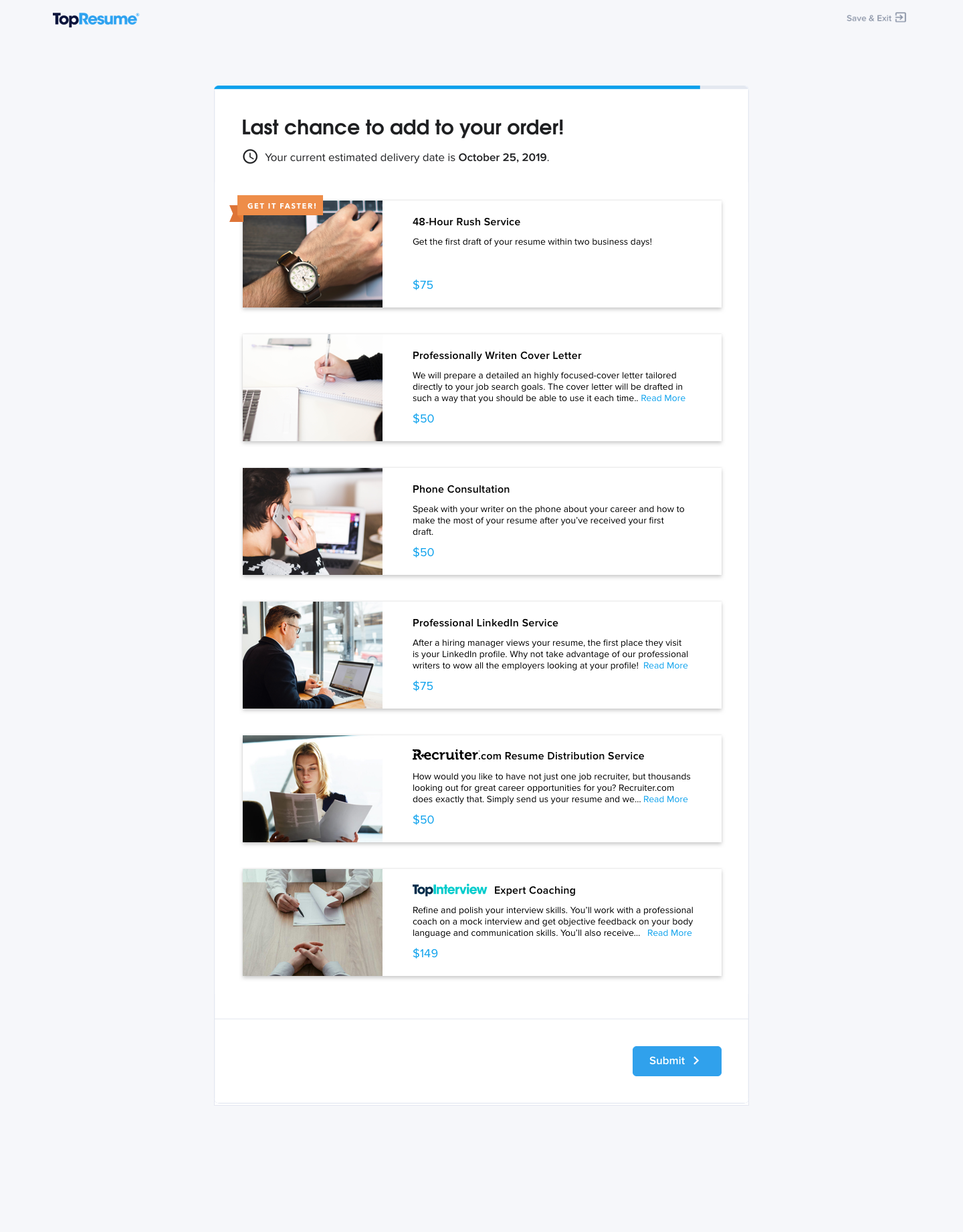
While completing a visual audit, and competition analysis, I noticed the amount of text and lack of visual elements on the Post-Questionnaire Upsells Page (a.k.a the Last Chance Page). Giving users images to attach to the upsell items, and giving them less to read could help them have a better experience.
A previous test with a similar hypothesis didn’t win, but it also didn’t statistically fail. It is possible that we were trying too small of a change to see significant differences. This test was meant to take a bigger step towards adding visual elements.
Hypothesis
The lack of pictures or visual elements hurts the sales of upsells, adding images will help sell more upsells.
Simplifying the UI could help reduce friction and increase sales.
A (Baseline)
B (Images and CTA Changes)

Results
Last time checked, this test had B winning at a 5.2% increase in revenue per customer after 2 weeks.
Next Steps
If this test wins, another test of using these images for the entire user experience and all the product pages would be a logical next step. Another opportunity discussed in the next test is to run this test as a multivariate one to see if there is any interaction effect to having different UIs on each upsell page.
If this test loses, a post-mortem will be required. Checking to see if the amount of items per customer changed along with the revenue could be important. If some items sold better, but less were sold overall, this could be an issue with how long the page had become, and this could be fixed by having less items per page or shortening the items and their descriptions.
A/B Test 2: Visual Hierarchy
Background
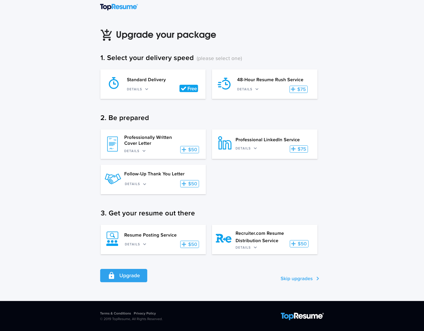
While looking for ways to improve upsells conversion, completing a visual audit, and conducting competition research, I noticed the amount of items on the Post-Purchase Upsell Page (a.k.a the Upgrade Page). The amount of items was much higher which might be causing frustration for users or even just a slower process due to Hick’s Law. There is a chance this was hurting our upsell revenue, but reducing the number of items on this page also had a chance to reduce revenue. Therefore we needed to look for ways to reduce friction in the selection process without removing items.
Another idea I was working on was presenting users with a choice between Standard (7 day) Delivery and 48-Hour Rush Delivery. At the time, 48-hour rush was presented as an upsell item but it was not put in context with the standard delivery rate. By requiring users to opt-in to either delivery option, we could increase sales of 48-hour delivery.
Hypothesis
By breaking down the upsell items into ordered groups, users may feel less overwhelmed by options and more likely to buy upsells (or more of them)
By adding the option of standard delivery and requiring users to opt-in to select standard delivery, more users will purchase 48 hour rush delivery.
A (Baseline)

B (Hierarchy)
Results
Last time checked, this test had B winning with a 4.7% growth in revenue per customer after 2½ weeks of running.
Next Steps
The plan after this was to combine this test with the Images test, to see if having UI differences between the two upsell pages increases or decreases sales. In other words, are our users more likely to pay attention when they see something new, or are they more likely to pay attention when they get a second chance to buy the same thing.
On top of that, there are other tests we could run on pushing the standard delivery opt-in to the payment page to make that decision more seamless, while weighing the risks of cart abandonment.
A/B/C Test: Scorecard
Background
Most TopResume purchases start with a customer receiving a resume critique. For the first 30 days after receiving their first critique, customers who attempt to upload the same, or an updated resume and get a second critique do not get one.
30 days after their first upload, an upload attempt will send customers a Scorecard. Scorecards are sent very soon after this upload (minutes to hours). Customers are able to upload, and receive a scorecard once a day during this period . 140 days after their first upload, customers are able to receive a second critique.
Both the first and second critique convert much better than the scorecard (more detailed data needed on this).
While running a UX audit of the Scorecard Experience I noticed one of the major differences between the Critique and the Scorecard UX is the lack of a persona. Both first and second critiques set up the scenario of someone seeing your resume, and spending time on it by sending it the next morning. There were also some opportunities to change the placement of the CTAs to make traveling to the product page easier.
Hypothesis
By adding messaging from a persona in our scorecard, trust in the product will increase, and therefore the conversion rate from the scorecard will increase.
By moving the final section of the page (with the CTA that takes users to the product page) to the top, and adding another segment at the bottom (a copy of the bottom segment on our critique), users will more easily end up on the product page and therefore more users will purchase.
A (Baseline):
B (Persona Messaging):
C (Persona Messaging + CTA move and New segment):
Discussion & Next Steps
This test has yet to reach statistical significance as it has only been running for one week, but planning has begun on next steps.
Decreasing the window from 140 days is an easy next step to take. I usually advocate for a more substantial A/B test first to make sure products aren’t stuck in a local maximum. Starting with a test of decreasing the time required for a second critique to 90 days would give Talent Inc a chance to better understand what good or harm that would do.
If the persona is successful, we were also planning on including it in the email chain started when a user asks for a scorecard. This addition of personas has been successful in past tests, so adding it to other products should be an easy test.