
Messenger Redesign Challenge
Part I - Exploring and Understanding
Defining the Value Proposition
Messenger states on its App Store description that it helps “instantly connect you with the people in your life” in a “free, fast, and secure” way. While apps that provide similar features exist, the main value for messenger is in providing a way of contacting people in your expansive network of friends on facebook. Overall this means the app is meant to provide many ways to communicate with someone while lowering the energy cost needed to make that connection.
Understanding the User base
Due to Facebook having so many users, calling the user base for this app wide is an understatement. The user base for the messenger app includes the more than 1 billion mobile active users. This means the design of the app must accommodate for a diverse user base, and understand a wider range of use cases.
Evaluating the current Product
Evaluating a product like this is best done with a multifaceted approach. This covers the most ground and reinforces findings from different. With the interest of time, I used the four following methods to evaluate Messenger.
Interviewing Users
I ran 11 quick interviews with daily users of the Messenger App using a simple adaptive interview method to gather a breadth of information. 8 of these interviews were over the app, and 3 were in-person.
Observing Usage (In-Situ)
I observed 2 users of the app navigate and chat with their friends (with their permission).
Heuristic Evaluation
I ran a quick Heuristic evaluation of the app to gather any other easily noticeable pain points throughout the user flow. This involved completing usual tasks like starting a new message, a new group, navigating through multiple messages, searching for an old message, sending a link, and several other tasks that will be discussed later.
Competitor Analysis
Given that Messenger has many competitors with similar features, I completed the tasks above in these competitor apps. These apps included WhatsApp, iMessage, Slack, and Skype.
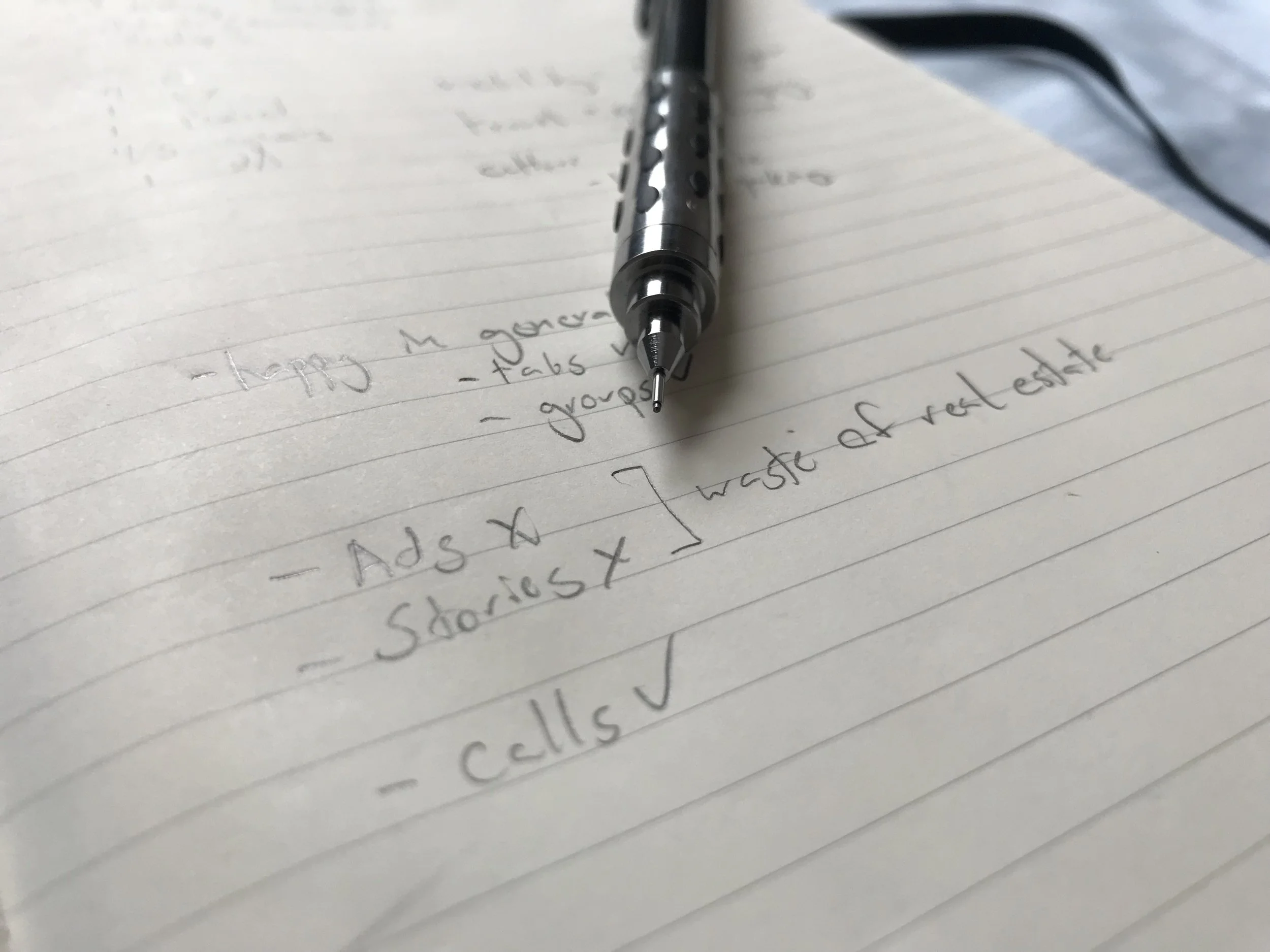
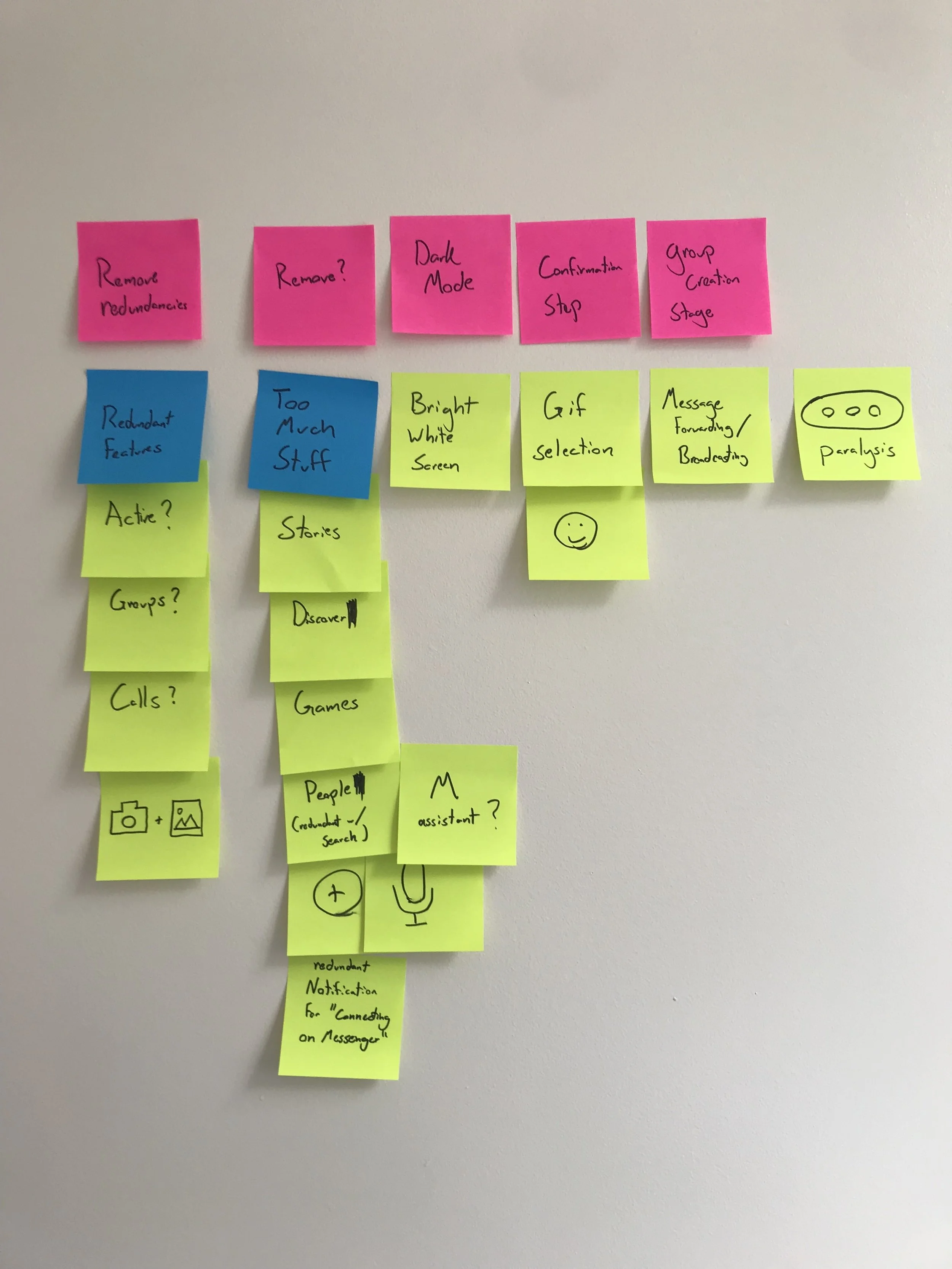
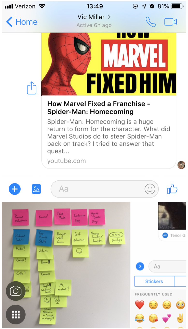
After collecting information on pain points in the app, it was important to group and prioritize these issues. Using sticky notes to do this, usually helps in the brainstorming process, and led to the insights I talk about in the next part.
Things Messenger is Doing Right
Before going into how to fix some things that are wrong with the Messenger app, I did want to mention what I think the app is doing well. These are the things I avoided affecting.
The basic experience of composing new messages, sending them, and reading them was well done without much friction. This includes the feature of seeing what messages were viewed, and the detailed view of individual messages to see when they were sent. Features such as changing the color, or the easily accessible emoji in each chat was useful in distinguishing them from other chats, while not burdening the average user.
The experience of chatting within a group was also well done. While this can be more complicated due to more people viewing and sending messages, they created a great way of seeing how much individuals in the group had seen up to (smaller images of each profile). In the detailed view, features such as changing peoples nicknames were noticed by some as a fun addition that also avoided burdening the average user.
Highlighting and creating clickable features in the text like phone numbers, addresses, dates, and websites with previews, helped lessen friction and information loss for users.
Sending reactions to messages even when they are further back in a conversation was also viewed as beneficial because some messages could be buried by other topics, especially when in group threads.
Part II -Pain Points within the App & why we need to fix them
“All the Extra Stuff”
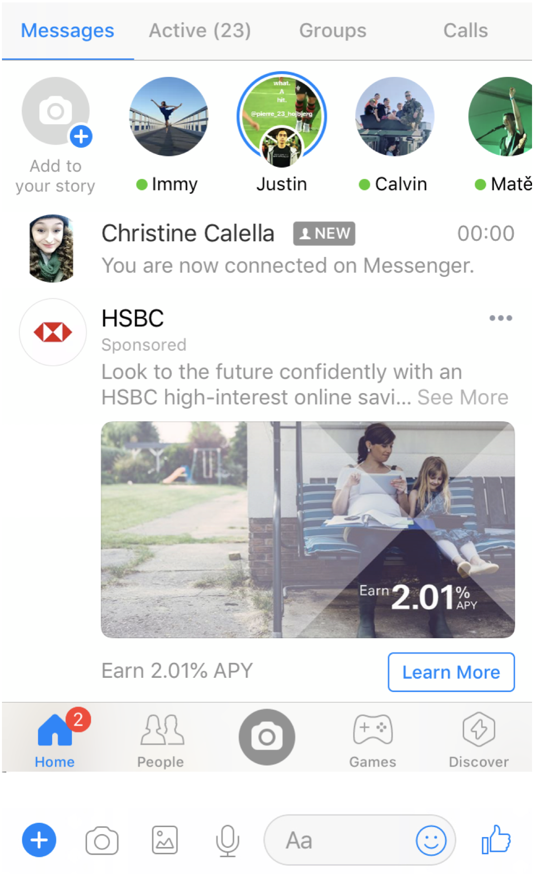
UI that lead to more confusion. Several users downloaded the “lite” version of Messenger to get away from these distractions. All of these unused features take up valuable screen real-estate and mental load that can be utilized in more effective ways. These so called “Extra Features” on were most frequently described as these five:
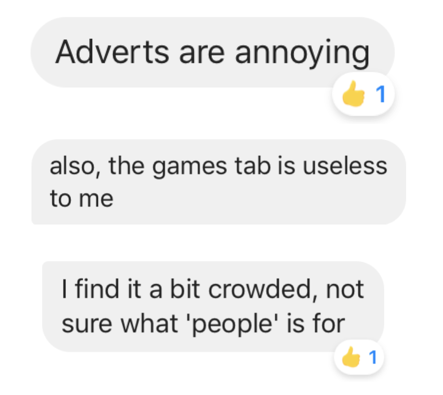
Stories
The Camera, Games, and Discover navigation options
Ads
The options taking up space by the text input bar in the chat view
The notification for new friends being “connected” on Messenger
Bright UI
Several users complained about the brightness of the app, as they use it at night and in dark environments. This harmed their experience with the app as it was difficult for their eyes to adjust between the the screen and the environment. This complaint also arose from when users were using the app in bed before sleeping, as it harmed their ability to fall asleep.
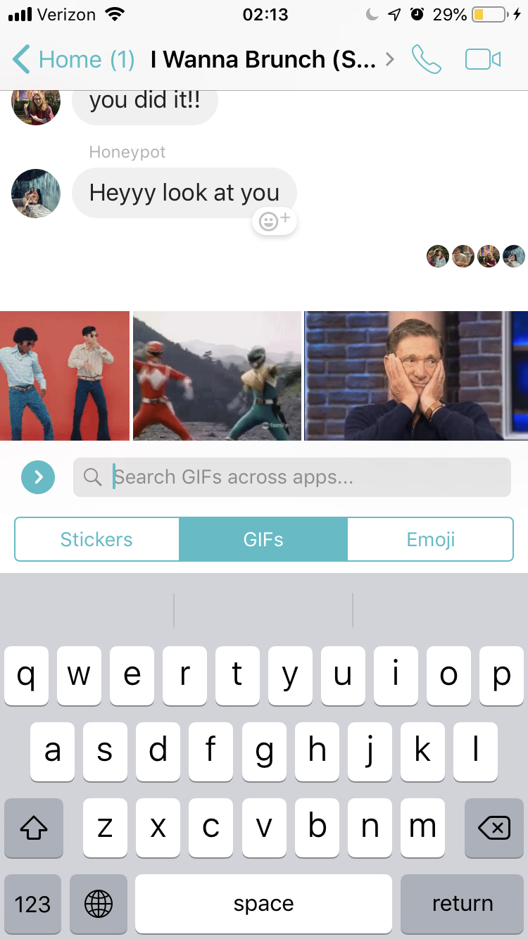
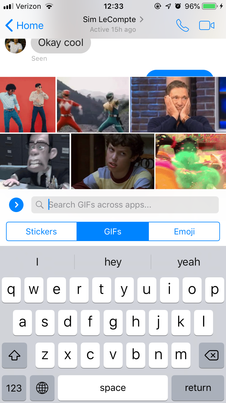
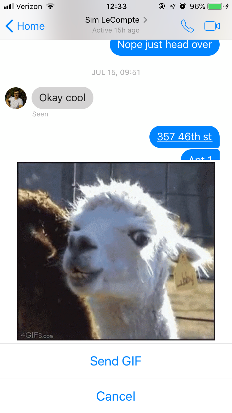
Gif Selection
The final common problem I came across, and heard from users was smaller but users came across it frequently. When choosing to express themselves using an emoji or a GIF, users complained the process was a bit too complicated and error prone.
Stickers, which seem to be the least used feature among my interview participants, were always in the way of selecting GIFs or Emojis.
On top of this, to send a GIF, you must select it by scrolling horizontally through options. Once selected one press will send it. This frustrating interface not only takes longer to search, but also is prone to accidentally sending an unwanted GIF as there isn’t a confirmation step.
Part III - Solutions
“the Extra Stuff”
This first adjustment in the design takes out the top navigation, stories, active users, camera, discover and games in the main page. These distractions were taking up valuable space on the first page users see when they come to the app. With the extra space on the navigation bar, Groups was brought down from the also removed top bar. “Calls” was also removed as this feature is already available by going through individual chats.
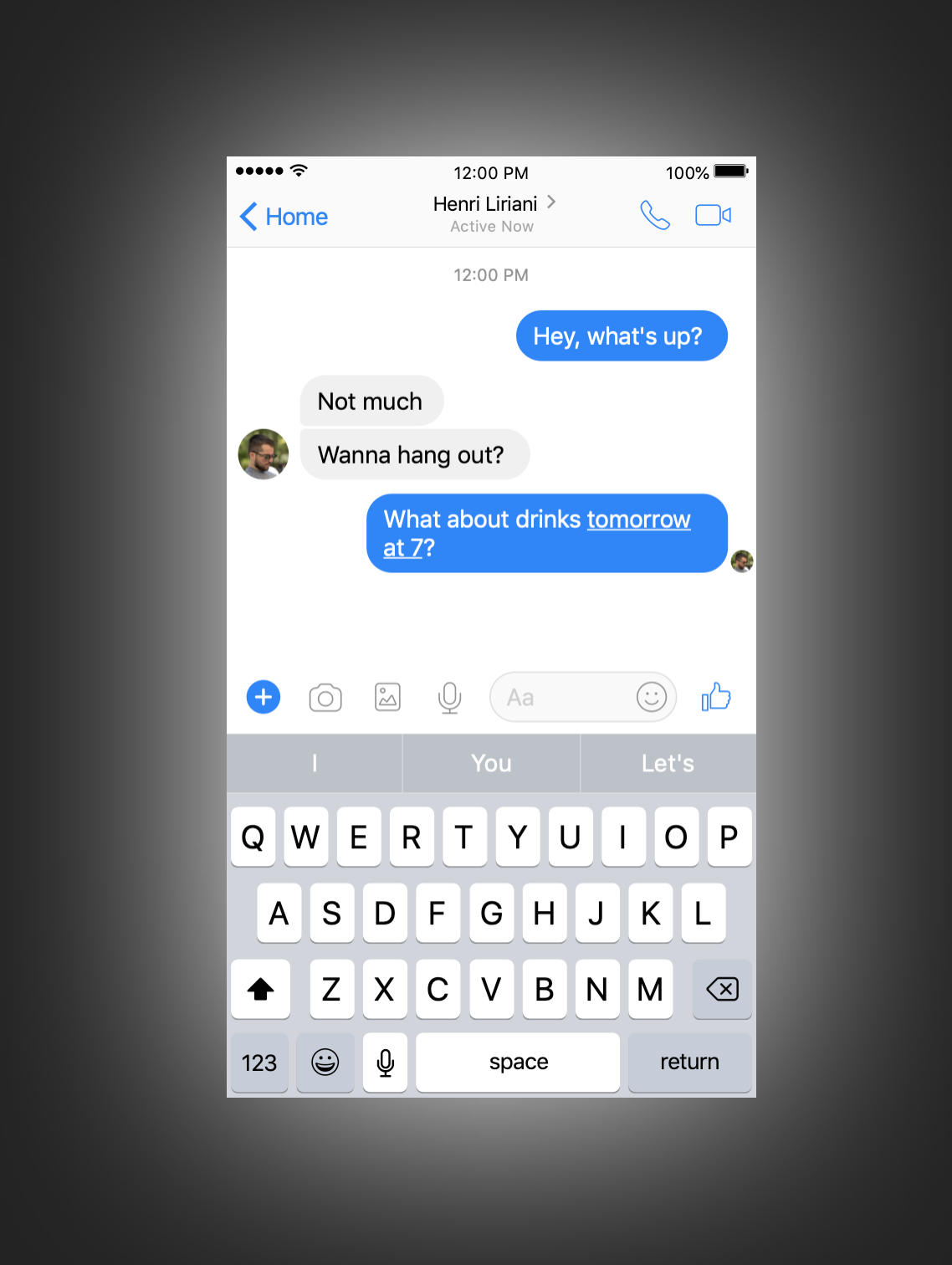
The next adjustment was to remove some of the extra features surrounding the message compose field (voice messages, and camera). This allows for a larger target for the most frequently used tap (when thumbs need to hit the text input field to begin writing a message).
While the voice messages were not used by any of my interview participants, photos were sent occasionally. These were usually sent from the camera roll, and not taken in app (there was some confusion on if those images are saved or not). To reflect that usage, the camera button was moved to the left side of the camera roll.
Dark Mode
Creating a dark mode was an easy solution to the complaints users had about using the app in dark environments. Several social media apps already include night modes in their settings, and with the growing use of OLED screens, dark UIs will save users some battery life. Implementing this feature in a way that would automatically switch to dark mode after sunset could save users some time as well.
Gif Selection
A noticeable improvement to this section is fairly simple as well. First, I increased the GIFs browsing field to two rows. This was to make scanning easier, while being economical with data usage if the phone is on a cellular connection. Next, I implemented the same confirmation step Messenger gives you if you paste an image into a chat. This allows you to preview your message in case you selected the wrong GIF.
Other Possible Fixes or Features to try
There were several other ideas I did not have the time to work on, but wanted to express my interest in.
Coloring each person’s messages in a group individually to make them more easily identifiable.
Allowing a new message to be sent to multiple people separately, to remove needing to copy and paste or “forward” multiple times.
Simplifying the details page of Group Chats
Final Note
The decisions I made with this redesign were done purely to benefit the User Experience. I understand that there are products where sometimes a better User Experience must be traded for success in other business goals. This hypothetical redesign does not take those business goals into account. Easy to find examples of this are monetizable features such as advertisements and stickers or engagement driving features such as stories.
Thank you for taking the time to read my work.