
Senior Product Designer
Addepar is a company that provides portfolio management firms, larger banks, and single family offices with reporting and analysis tools to help make sense of the capital they manage. While I have worked across several teams at Addepar most of my time has been spent working on building new features and improving on a complex mature product built for generating dynamic financial reports at scale. Other than the reporting platform, I also designed the earliest stages of a business intelligence dashboard, and contributed to our new holistic dashboard and data visualization framework. Overall, I would say the largest investment in my skill set at Addepar has come in the form of better understanding team processes and opportunities for improving them through leadership.
Addepar Project 1: chart theming
Feature set Planning & Execution
The Report editor product as it was when I joined the team
Background
Addepar’s reporting platform is a powerful tool for creating financial report templates. These templates can be fed through the list of our clients’ clients and dynamically generate reports at scale. Due to this, the reporting platform is very capable at handling our clients needs whether they are a single family office, or an enterprise managing the portfolios of over a hundred thousand clients.
Leadership was looking for opportunities to make the whole platform work better at scale. In a meeting with the team leads, my PM, EM, and I decided we should spend a chunk of the year on researching, designing, and building a deliverable improvement for our clients in this field.
This work would have to be placed along side already planned work taking up some team bandwidth.
Starting Point
The report editor platform I inherited was a pretty mature product with many users. There were Enterprise power users, SFO users wanting to “set and forget”, and RIAs falling somewhere in between
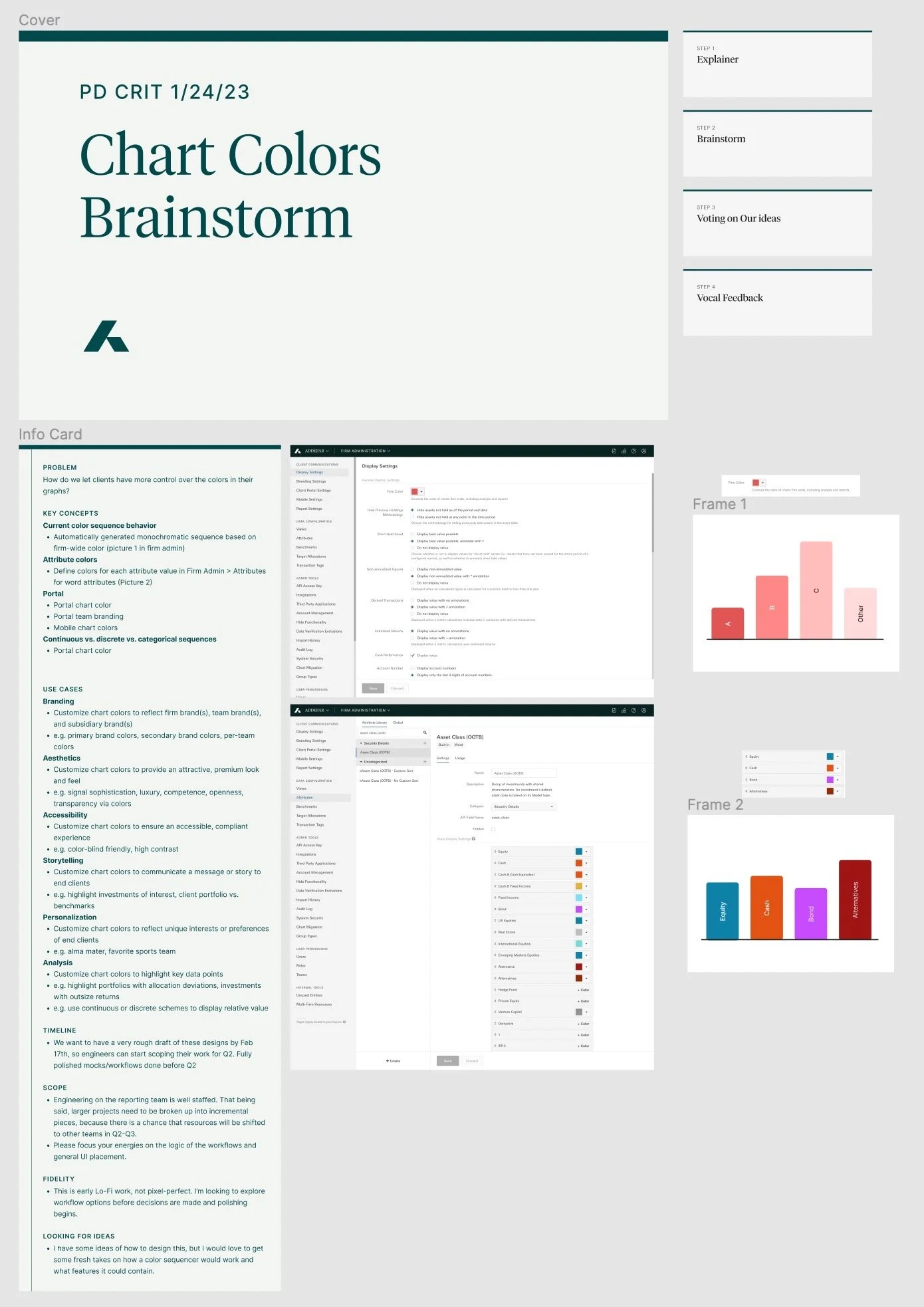
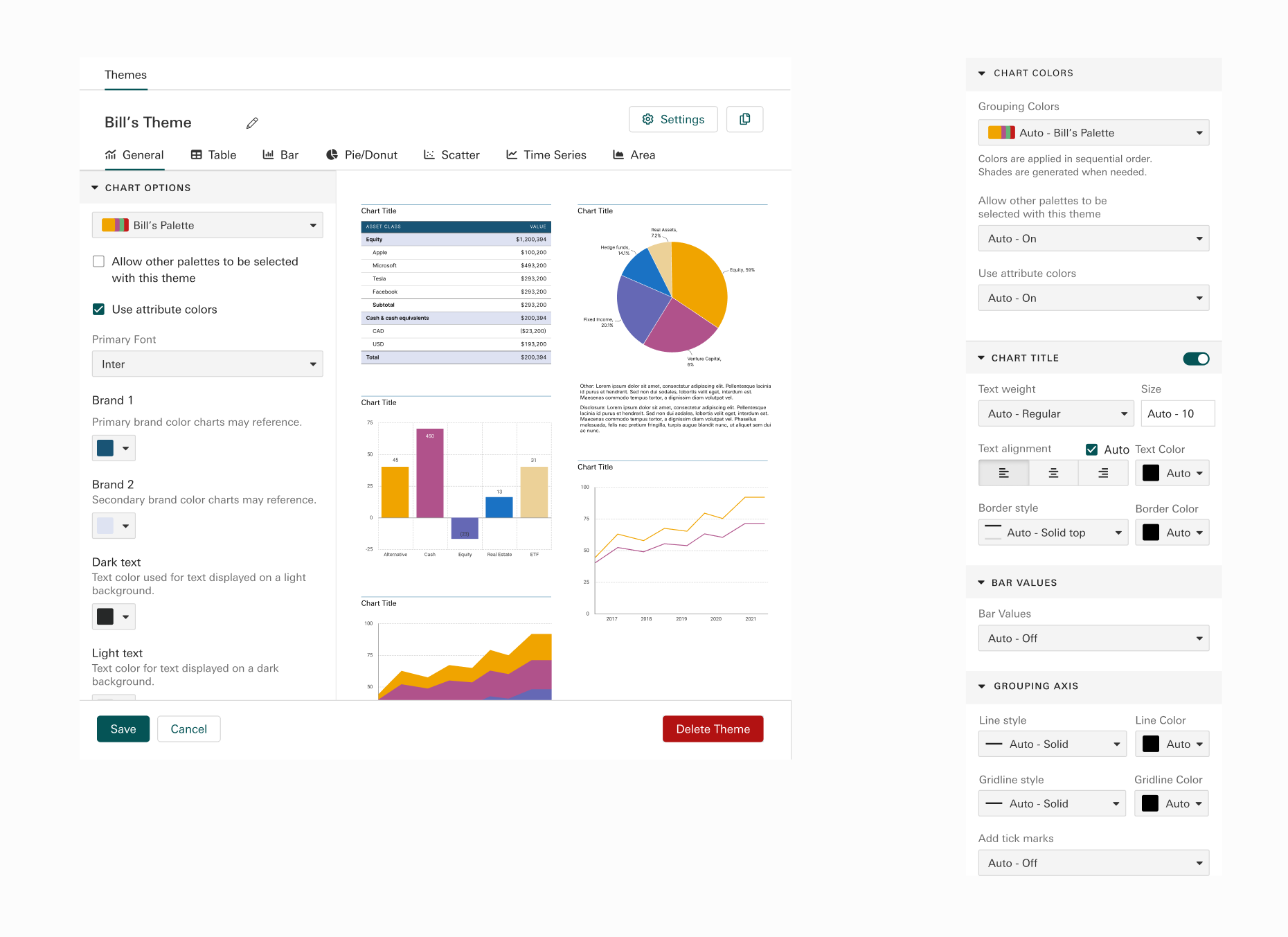
Firm admin settings had become a bit of a dumping ground for new features that needed to work at scale, while the report editor had settings for specific reports. Two of these setting effected chart colors firm wide:
1) A “firm color” that is selected in firm-wide settings (first image). This means that if a firm had branded with the colors red and blue, they could only pick one. Whichever color they picked would then populate the first item on a chart, with lighter shades of that color populating the rest of it.
2) Attribute Colors (second image) would allow a firm to set a certain attribute value to be a certain color. For example Cash could always be represented by green in every chart generated for every portfolio.
Step 1 - Planning and Gathering Research
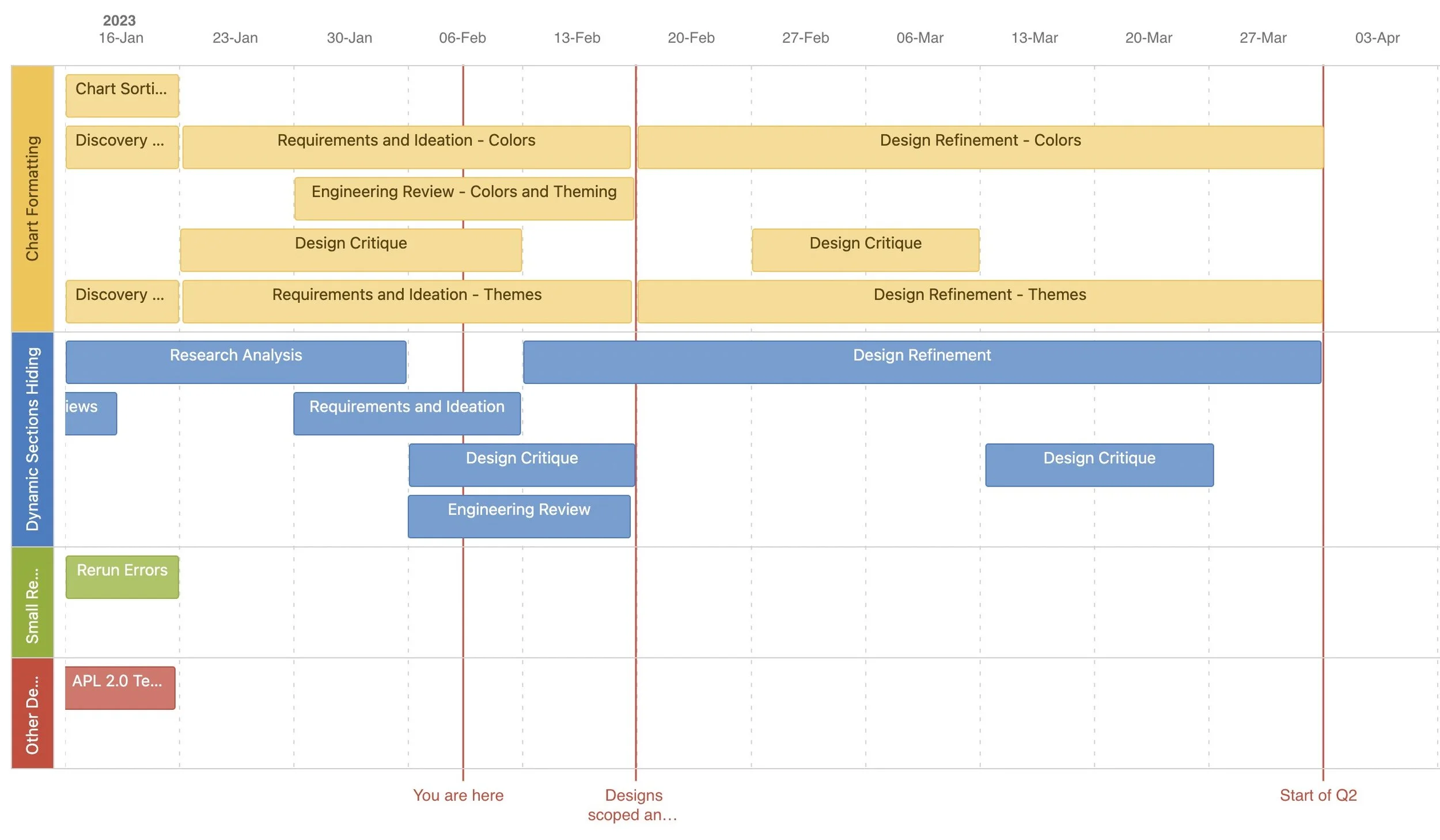
First, I planned out the quarter, as this work was being juggled with other projects. This also set expectations, put the cost of changing plans into perspective, and kept work organized for shared Product Design resources.
To add pressure to all this, I was informed by the PM and Engineering manager that they wanted to start work on developing this project in Q2. In order to keep things moving, I worked out two deadlines with the team so we could work on parallel tracks:
A deadline for the main concepts down so engineering could start to scope the project
A deadline to have all mocks prepared
Research resources were gathered in three channels.
Semi-Structured interviews and validation sessions with clients.
I started organizing multiple steps right away to give the team deadlines and align with clients’ schedule.
Addepar maintains an ideas portal where clients of ours can create and vote on new features they would like to see added to the platform. This is the easiest place to gather comments and concerns although it can be a raw feed of the loudest voices.
Internal feedback from coworkers on other teams who work closely with our clients was my next route. I scheduled weekly feedback sessions with sales, and customer relationship managers.
Data from the usage of an older table theme feature.
After taking time to codify and distill my notes from the research I presented these findings:
The largest clients had teams that were building all reports to be dynamic down to the section and tables. Any tools to help centralize those decisions would help scale.
Larger clients had teams dedicated to best charting and branding practices that they weren’t able to use.
Users hated the way our chart colors worked.
An overwhelming majority of users were “breaking” table themes because they needed just one change.
Step 2 - Design Kickoff
To kick things off, I met with my team’s PM to set performance metrics goals and timeframes on adoption and usage. Chart theming was an obvious feature set we had to consider adding to the product. I scheduled time for workshops to make sure chart colors, and other ideas were explored.
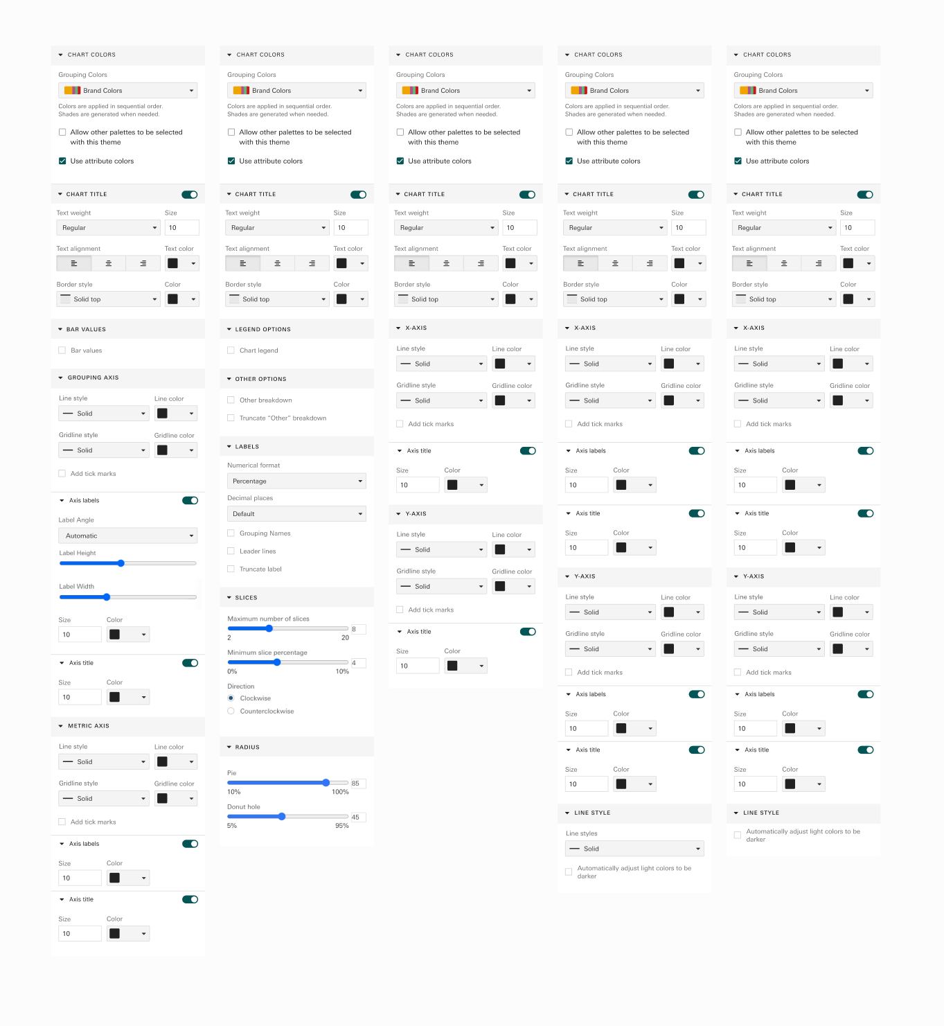
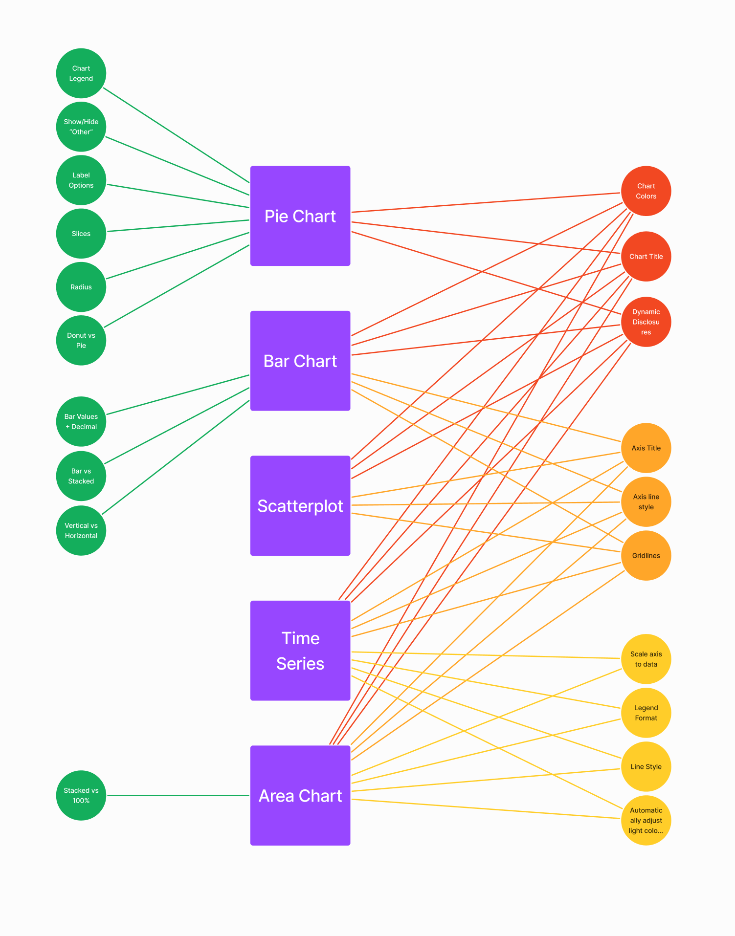
I also began listing out current and future chart settings among each chart type. This was to begin exploring how to organize them. On the right here you can see the abundance of options I sifted through, and a visual I used to help organize them.
Step 2 - Workshop Facilitation
To generate and distill ideas quickly and thoroughly I ran cycles of two workshops in Figma & Figjam:
Design workshop
Me, PM, Lead Engs, PDs from closely related verticals
After explaining the idea and problems, have them silently work on generating 2 or 3 ideas in limited time.
Walk through ideas and highlights
Critique workshop
Similar attendance plus other designers for cross pollination.
Walk through ideas that were refined from design workshop and asked for comments and votes.
Looking to poke holes.
There were a few results from these sessions:
A new feature of Color palettes saved in sequential order. This would afford our users the ability to solve the chart color customization problems they were having, while easing migration to a new feature set.
A new mechanism for themes, where charts could “Inherit” and “Override” theme defaults without unlinking from a theme entirely. Many options for how this mechanism would work were explored.
An option for “Centralising” common settings across different chart types. This was to make workflows more scalable, but it came at the cost of requiring users to learn a more complex mental model.
All three of these design decisions were polished and organized into clickable prototypes for validations sessions.
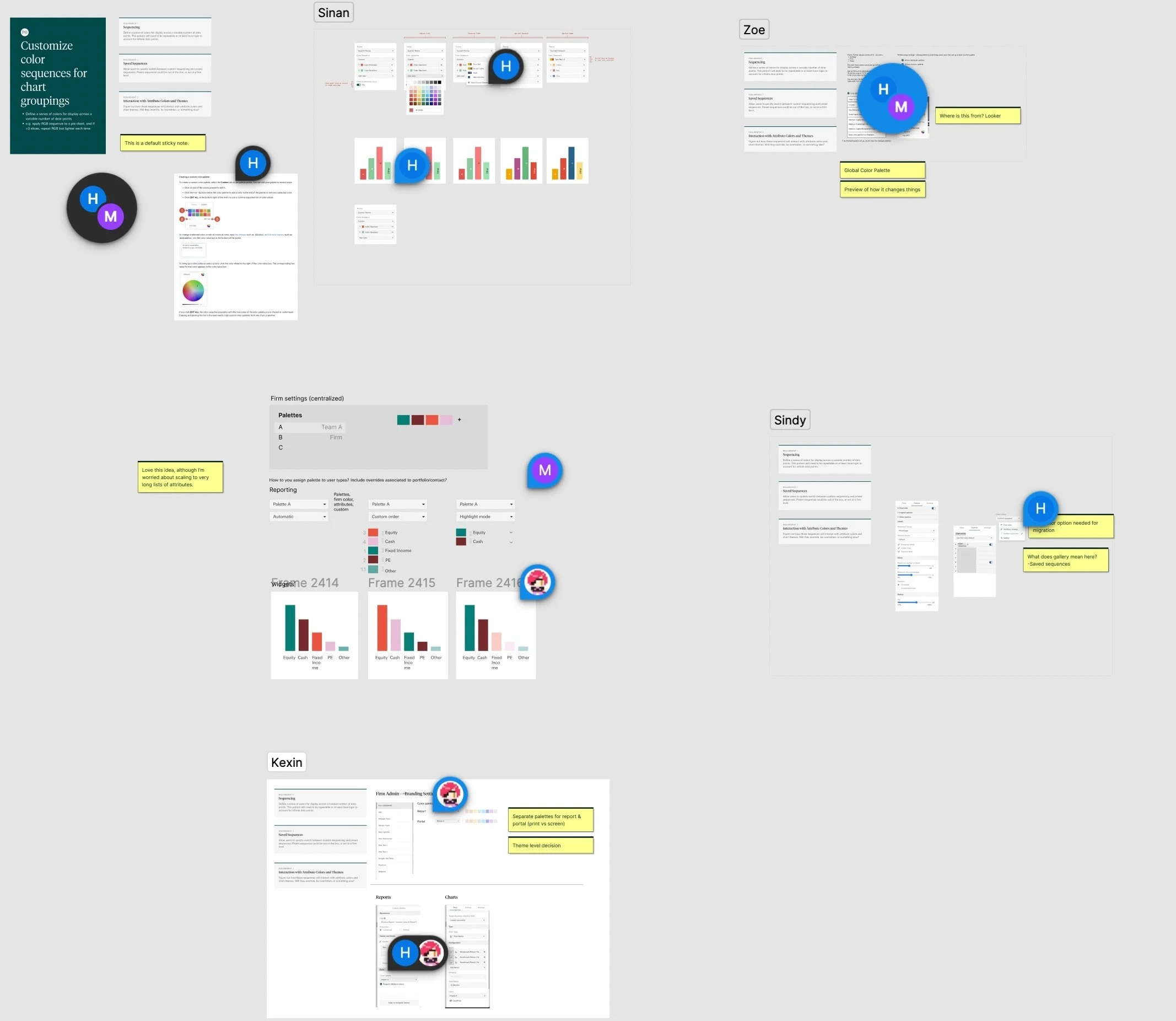
Sequential color palettes
Theme Inheritance options
Theme centralization
Step 2 - Stakeholder Curveball
Unfortunately a week before validation sessions were scheduled to start, the PM became very passionate about two ideas:
Abstracting the chart themes as it’s done in Google Slides/Sheets. He believed it would help hold the hand of users who want the simplest “set and forget” use case.
Using an “Auto” function for theme breaking over a “Override” one.
While I brought up that this could clash with the overall goal of helping the platform scale for enterprise clients, and pre-made themes we could provide for these users, he still pushed for it.
To make sure he felt heard, I fleshed out his ideas and added it to the validation sessions. The users sentiments would prove to be the best argument.
Step 3: Validate and Iterate
I tested the options with functional prototypes shown to users spanning Enterprise, RIAs, and SFOs. For each option I briefly introduced the idea, then had users complete a few tasks they would have to do regularly.
For the sequential color palettes option, the ideas we presented were met with overwhelming positive feedback, but these sessions also revealed a few opportunities :
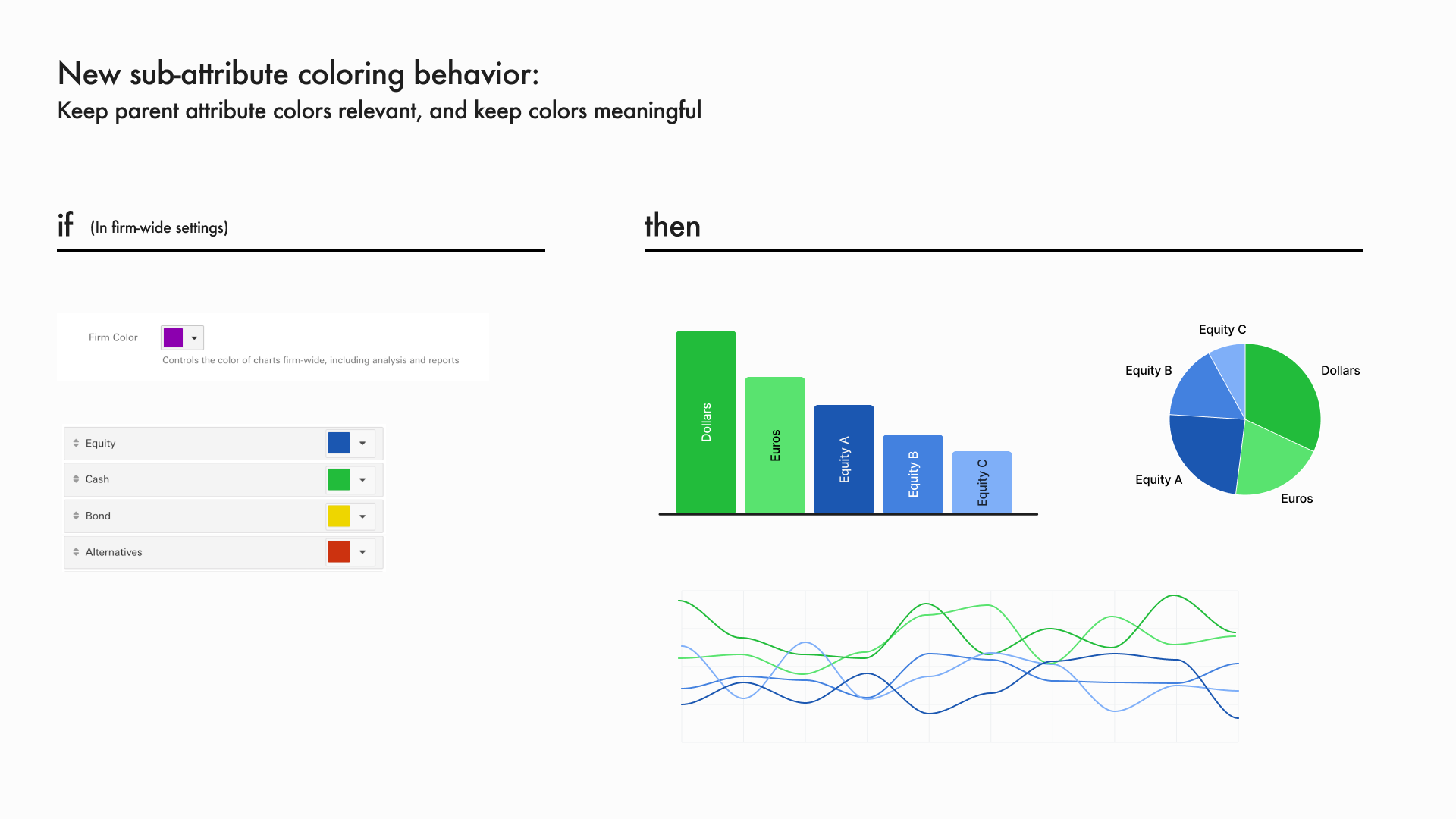
Sub-attribute coloring (next two images below) would help our client’s keep meaningful color relationships alive whenever they add another level of complexity to charts.
Team based palettes for our enterprise clients’ more scale centric needs. This would prevent a glut of palettes across the whole firm.
Color sequence rules for future chart types like maps.
These new opportunities were explored with clients, but ultimately shelves for this iteration to prevent scope creep on our development plans.
For the Chart theme inheritance options I also received positive feedback on the new “inherit, override and revert” mechanism.
For the Chart theme centralization options:
Clients claimed that the baseline option was straightforward but thought it was cumbersome once I asked them to change settings on my functional prototype.
Clients thought the abstracted option would be helpful for setting up themes, but would quickly get in the way afterwards.
All clients preferred the option with more centralization, especially when paired with the new inheritance mechanism.

Step 4 - Handoff and Retro
Handoff
With clear sentiment from a diverse set of users, the green light from stakeholders, and a looming deadline, I pushed forward with the user’s preferred option.
I presented the final ideas to the engineering leads during our weekly meetings, answered questions, and did visual QA when it was on its way out.
Impact
I coordinated, designed, and delivered the chart themes and colors features together on time.
The features were validated before release, with users and internal stakeholders in the loop.
I steered the team away from ideas that would’ve distracted from our scalability goals.
Attempts to change the deadlines or add more work for my design team were put into context with the available timeline.
Outcome
Adoption with the clients we spoke with was almost immediate upon release
Adoption and usage was growing quickly, despite some larger clients being slow to change.
Unfortunately I never got a full year of adoption and usage stats.
Especially positive feedback from enterprise clients
Customer success team reported back lots of positive feedback.